Monday, 20 December 2010
Monday, 13 December 2010
Evaluation
1. 
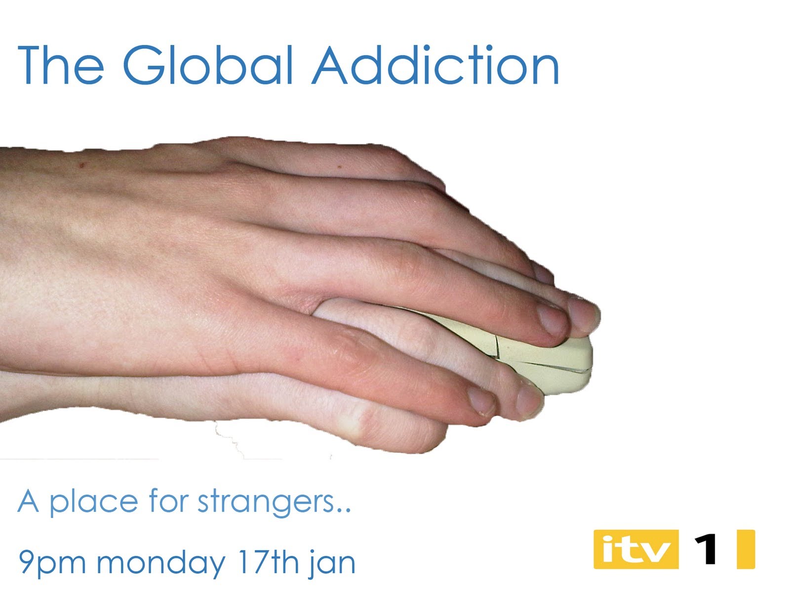
A place for strangers is also clever i feel as its similar to my space's slogan 'a place for friends' that's another reason why i feel the slogan is very good.
If prezi doesn't work click this link http://prezi.com/f2wfryzyttuv/copy-of-question-4/ or copy it into the address bar.

Our framing follows the mixed documentaries convention also we have put the graphics in the bottom corners as i will show with a screen shot of our production against a screen shot from another proffessional production.
These two pictures show the framing the one on the right is from our production and the one on the left is from a proffessional production as you can see they both have there eyelines 1/3rd down the page looking into the space (talking space).


These two pictures show the framing the one on the right is from our production and the one on the left is from a proffessional production as you can see they both have there eyelines 1/3rd down the page looking into the space (talking space).


In regards to the the examples of print adverts i have struggled to find any print posters advertising documentarys so I just had too use examples of all print adverts by ITV to follow the and this was the only one i could find.
2.
A place for strangers is also clever i feel as its similar to my space's slogan 'a place for friends' that's another reason why i feel the slogan is very good.
Also the print advert goes with the slogan as it shows a metaphor of how on-line someone could be stalking someone else and know one would care but if someone actually did that and put there hand on the other person then it would be seen as a crime. Soi i feel our print advert challenges people perception of the on-line world.
3.
Dave liked how there was a music bed and it made it interesting.
Dave liked how there was a music bed and it made it interesting.
But he felt we needed a wider range of interviewees and thought we should of got someone else who was addicted to social networking.
Natalie thought that the theme was very good as it was relevant to the times we're in, but she felt we should of included the social network trailer as it shows how big social networking has become.
Again Hannah thought the theme was good, again as it was relevant.
She felt we should have used a wider range of websites because we seemed to centre the documentary on facebook.
She also found it quite annoying how in one of the interviews it cut out at the end and went into some archive footage.
In conclusion i feel that we hit the target audience we were looking for perfectly as 2 out of the 3 said the theme was relevant to them (young adults).
In hindsight of what i now know i feel i could of given the documentary a better feel in terms of the flow. Also i feel i could have used a wider range of websites and interviewees. But I stick with the theme as it was very good in aiming at our chosen audience.
4.
Sunday, 12 December 2010
Print examples and codes
Most print posters have the ident bottom right have the slogan, time and date on the bottom left. The title along the top with a basic photo with channel 4 being the acception as sometimes they edit photos i will show some examples of print poster and theyn display mine underneath Them.


Tuesday, 7 December 2010
Radio Advert codes and convensions
Radio adverts are usualy around 1 minute long have vox pops from the documentary and the voice over explains and trys to sell the documentary. they say what time the proggrammes on, what day its on and the ident at the end. There is always a sound bed in the advert.
Sunday, 5 December 2010


Subscribe to:
Comments (Atom)